ShopDreamUp AI ArtDreamUp

Deviation Actions


Suggested Deviants


Suggested Collections


You Might Like…


Featured in Groups


Description
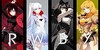
Heya! finally I finished my RWBY vol 5 artworks , so much fun to paint them :3
here I made Full HD wallpaper of my artworks. (Just hit the download button)
each RWBY artworks:
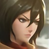
:origin()/pre00/1453/th/pre/i/2018/054/c/6/ruby_rose_by_zienu-dbyncvg.jpg)
:origin()/pre00/4e95/th/pre/i/2018/010/7/f/weiss_schnee_by_zienu-dbzkhk5.jpg)
:origin()/pre00/462f/th/pre/i/2018/014/b/0/blake_belladonna_by_zienu-dbzzjtp.jpg)
:origin()/pre00/0f69/th/pre/i/2018/054/f/f/yang_xiaolong_by_zienu-dc43l9c.jpg)
Like my artworks? please consider to Buy Me a Coffee
here I made Full HD wallpaper of my artworks. (Just hit the download button)
each RWBY artworks:
Like my artworks? please consider to Buy Me a Coffee
Image size
1920x1080px 967.96 KB
Comments12
Join the community to add your comment. Already a deviant? Log In
Hmmm. They're all really good. The only one that seems off to me is the yellow one. (It's been a REALLY long time since I watched RWBY and I don't remember any of their names, except for Ruby. Lol) Just something about her seems...off. You may just need to work on views looking upwards. Her face looks good, but then it kinda looks like it's just sitting on top of her shoulders. I know that her neck isn't visible because of the collar. That's obvious even if you haven't ever seen the character before so I know that that part isn't the problem. Maybe if her head was a little bit smaller, or if you could see a little bit under her jaw might help. Or making her shoulders a little wider. The proportions you have, look the same as the ones who you're looking at from straight ahead, but when you change angles like that things sometimes look like they're stretching or shrinking slightly. So her shoulders would probably look slightly wider than the others, which would probably help her head not look so off.
Other than that though they all look absolutely fantastic. They're all lovely and I can tell who each of them is quite clear. The lighting and shading on them is beautifully done. Good work <img src="e.deviantart.net/emoticons/b/b…" width="15" height="15" alt="